 UX design, or ‘User Experience’ design, may very well be the fundamental key that’s been stopping mobile commerce from truly taking the world by storm. While a few adventurous retailers have embraced the mobile commerce market, m-commerce as it is known accounts for only 16% of all e-commerce transactions, though that number is poised to rise. eMarketer, a leading market research analysis firm, recently revised its estimates of the sector’s 2013 sales volume upwards, to well in excess of $41 billion -- in the United States alone.
 However, the m-commerce sector has a great number of hurdles to overcome in terms of usability and user experience. Shopping cart abandonment rates for mobile sites are far higher than typical e-commerce rates largely due to the limitations of the device. As Simon Black, CEO of mobile payment firm Sage Pay points out, “Any form of data entry is a big no-no for a mobile site, so don’t make your customers enter anything but the most important information. Dealing with fiddly web pages to enter card details is one of the main reasons that shoppers drop out of the process when buying via a mobile device.” However, this represents a huge market opportunity for small and medium-sized retailers who can act quickly based on user feedback and testing to improve their quality of service.
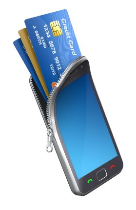
Integration of mobile payment systems such as Paypal or other digital wallet software can dramatically decrease the amount of data that customers need to enter from their mobile devices, which will likely decrease cart abandonment rates. Even the integration of the ‘Connect with Facebook’ login system can dramatically simplify the user experience for mobile shoppers.
Additionally, it’s important to differentiate between tablet users and smartphone users. Tablet users, largely due to the bigger screen size, have a conversion rate that is similar to desktop and laptop computers, while smartphone users converted at less than one-tenth of the rate of tablet users, according to Adobe’s ‘The State of Mobile Benchmark’ which was based on data from the end of 2012. However, smartphone traffic is constantly on the rise, and represents the single largest opportunity for retailers hoping to cash in on m-commerce. Responsive website designs that detect screen resolution and adapt accordingly can be a large help, but nothing can replace the value of a coordinated program of user testing and design adaptation.